



Brand Guidelines
We've created a set of guidelines to assist you in representing our brand effectively.
Please see our Brand Guide to understand how to bring our vision to life.

Logo
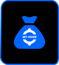
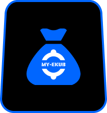
The logo should always be displayed in blue on a white background. On a deep blue background, the logo should be rendered in white. Please adhere to this color priority for consistent branding.




Clear Space
the logo's clear space should equal to the height of its top cut on all sides.
This buffer ensures that the logo remains distinct and uncluttered.

DOS AND DON'TS
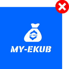
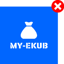
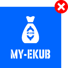
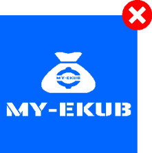
Do not stretch, distort, or alter the logo in any way.
This includes avoiding any modifications such as removing elements or squeezing, which would affect the logo's appearance and integrity.


Color
Our deep blue conveys the trusted roots and steadfast community bonds of the ekub tradition.
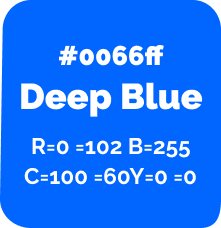
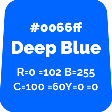
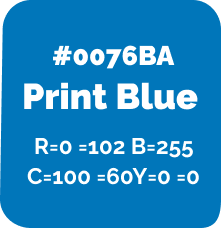
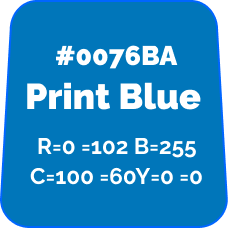
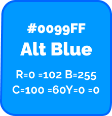
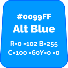
"MY-EKUB's Print Blue" has a lower contrast ratio of 1.01 with MY_EKUB’s Deep Blue than other blue options. The secondary color should be used sparingly, and primarily in combination with black or mid-tone colors for accessibility reasons.
Typography
To maintain a consistent and professional appearance across all platforms, please use the Raleway font family in all applications.

To ensure a cohesive and professional look across all platforms, please use the “Noto Sans Ethiopic” family in every geez script application.

ICONOGRAPHY
There and other marketing Icons should be employed to simplify complex concepts and enhance user experience by making information more accessible and intuitive.
.png)
.png)
.png)
.png)
.png)
.png)
.png)
.png)
.png)
.png)
.png)
.png)
Illustration
For illustrations, aim to use visuals that complement and enhance our brand’s messaging. Illustrations should be clear, engaging, and aligned with our brand's style. They should simplify complex ideas and add visual interest, while maintaining consistency with our overall aesthetic and applications scheme.

Applications
Apply our brand's colors, typography, and logo consistently across both digital and print formats, avoiding any distortion. Ensure high quality and clarity in all materials. Examples are provided below for reference.
.png)
.png)
.png)
.png)
.png)
.png)
.png)
.png)